A Brief Look at Goal Distributions, Part 2: Interactive Histogram
- Emmeran J

- Aug 17, 2024
- 1 min read
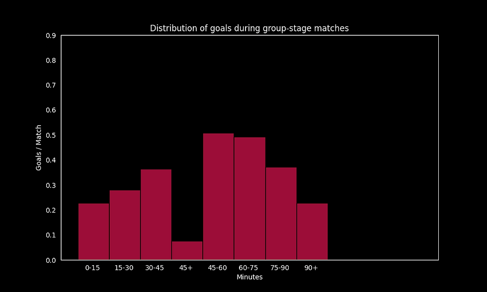
In a previous post, we looked at how goals were distributed throughout a match at international tournaments and at club level. In particular, we had a histogram showing the distribution of goals in 15-minute intervals of the match. In this post, we produce interactive histograms which allow the user to set the considered time-intervals and choose the league the data is displayed for.
This interactive plot was created using the python library plotly (and dash) and it is hosted online through render.com. The code is available on my github.
I am very much learning as I go with these interactive plots so please let me know if you have comments / feedback / suggestions. Thanks for reading and enjoy!

Comments