Goal Distributions, Part 4: A tale of two halves
- Emmeran J

- Oct 12, 2024
- 4 min read
Recall that the initial question in this series of posts on goal distribution was to understand what sections of a match are most entertaining (in terms of goals being scored). In this post, we provide answers to this question based on statistical evidence.
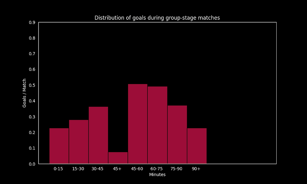
The following histogram from the previous post is helpful in visualising the claims and tests we will make and I encourage you to play around with it to get a better feel for some of the trends in the data.
A quick glance at the histogram above reveals that more goals are scored in the second half of matches. However, as in the previous post the key question remains: Is this difference statistically significant, or could it be attributed to random variation, which is inherent in both football and the data we are analysing ?
To carry out a statistical test, we will make some assumptions about the data. We assume that the number of goals scored in a fixed time interval of a match follows a Poisson distribution and that different time intervals are independent of each other. We will also for simplicity consider only goals scored in normal time (not in the injury time added at the end of halves) to avoid dealing with the asymmetries arising from the longer injury time added at the end of the 2nd half. The aim is to test whether the rate parameter of the Poisson distribution is the same for different time intervals of a match (say the first half and the second half). Although these assumptions may not hold perfectly in practice, they enable us to conduct a Poisson rate test, which can provide meaningful insights. The data we use is the data presented in the histogram above (namely, goals scored during the 2015/16 season across the top 5 European leagues).
First vs Second Half
The p-value for this Poisson rate test is 8e-10 suggesting very strong evidence against the null hypothesis that the rates are the same. Under our assumptions, we can confidently say that there is a statistical difference between the goal scoring rates of the first and second halves.
Within Half Analysis
Let's look at the first half in more detail. The plot below gives the distribution for bin-widths of 5 minutes.

It appears from this histogram that the opening 5-minutes are particularly low-scoring and the remaining intervals look fairly similar. Let's test this by carrying out a Poisson rate test for all pairwise 5-minutes intervals of the first half. The resulting p-values are given in the following table.
0-5 | 5-10 | 10-15 | 15-20 | 20-25 | 25-30 | 30-35 | 35-40 | 40-45 | |
0-5 | |||||||||
5-10 | 6e-3 | ||||||||
10-15 | 7e-4 | 0.51 | |||||||
15-20 | 2e-4 | 0.35 | 0.78 | ||||||
20-25 | 2e-3 | 0.74 | 0.74 | 0.55 | |||||
25-30 | 2e-4 | 0.33 | 0.75 | 0.96 | 0.52 | ||||
30-35 | 4e-5 | 0.18 | 0.49 | 0.68 | 0.31 | 0.72 | |||
35-40 | 2e-3 | 0.78 | 0.71 | 0.52 | 0.96 | 0.49 | 0.29 | ||
40-45 | 6e-7 | 0.02 | 0.11 | 0.18 | 0.05 | 0.2 | 0.36 | 0.05 |
Note that when we carry out many tests as we are doing here, the risk of obtaining false positives (Type I errors) increases. To mitigate this risk and ensure more reliable conclusions, it is important to apply corrections to adjust your p-values. One such correction is the Bonferroni correction which scales the p-values by the number of tests carried out (36 in our case), which in our case would bring some of the p-values concerning the 0-5 minutes interval above the 1% or 5% significance threshold. For many it would still remain below and we can also argue in relative terms compared to the other higher p-values.
So, from the above table, there is statistical evidence that the goal-scoring rate is different in the opening 5 minutes compared to all other intervals of the same length in the first half. In addition, there is no evidence to suggest that all these other intervals have different goal-scoring rates between each-other. Therefore, our initial hypothesis that the opening 5 minutes are particularly low-scoring appears to be statistically valid.
A similar trend appears for the second half. We can carry out similar tests (which we do not present here but can be found in the code) and find find much weaker statistical evidence for differences between the first 5 minutes and other 5 minutes intervals. We can attempt to reason about these differences. The sparsity of goals at the start of the first half could be attributed to caution as the game kicks-off and both teams are settling into their tactics. This is perhaps less the case in the 2nd half because they have already played an entire half and the 15 minutes break is not long enough to completely disrupt the rhythm of the match.
In summary, fewer goals are scored in the first half than the second, but within each half fewer goals are scored in the opening 5 minutes and the evidence that this is the case is much stronger and significant for the first half. To partially answer the original question, the "best" bit of a match to miss is the beginning of the halves (especially the first). Ironically fans in stadiums tend to leave early rather than arrive late to optimise their travel time. Their reasoning is probably that the gains of leaving 5 minutes before the end are greater than arriving 5 minutes after the start of the match but nevertheless it remains unclear to me if this is worth potentially missing a dramatic injury time winner.
The interactive plot was created using the python library plotly (and dash) and it is hosted online through render.com. The code is available on my github.
As always, I am very much learning as I go with these interactive plots so please let me know if you have comments / feedback / suggestions. Thanks for reading!

Comments